
A new suit for the consulting firm.
Focused on IT, Medtech and Industrial Engineering, QinMind is a consulting firm specializing in leadership, business development and quality assurance. I redesigned and developed QinMind’s digital presence, focusing on tailoring a new digital suit for the firm.
I transformed a dated website into a professional yet warm platform that speaks to two different target groups – potential clients looking for expertise and consultants looking to join as partners.
⚓︎ Context
Digital brand evolution
Website redesign
⚙︎ Tools
Figma
Adobe InDesign
Wordpress
❖ Team
Solo
01. The Why
The Challenge
The original website had become a bottleneck for growth due to brand misalignment and a lack of clear communication.
✦ The Audience Gap
The site completely ignored potential partners, focusing only on clients – leaving a gap in the firm’s recruitment strategy.
✦ Dated Design
The visual language was outdated and inconsistent with the firm's modern standing.
✦ Identity Misalignment
Because the site didn't show who QinMind really were, it created a gap between their expertise and their online presence.
The Goal
To evolve QinMind’s digital presence into a modern and warm platform that accurately reflects their professional standing and core values – tailored to attract both potential clients and partners.
02. The Discovery
I began with client deep-dive sessions to align on a shared vision and strategy. Through competitor analysis, I ensured QinMind would stand out while maintaining industry credibility. I worked from a detailed communication matrix provided by the client, which allowed us to align the content strategy with a tone that was lighthearted yet professional.

Key Insights
✦ Humanizing Tech
Emphasizing the human factor was essential to stand out in a technical industry.
✦ Navigation Hierarchy
A clear structure was vital to guide two different audiences.
✦ The Tailored Fit
The brand didn’t need a makeover, it required an evolution to match the firms current culture.
03. The Process
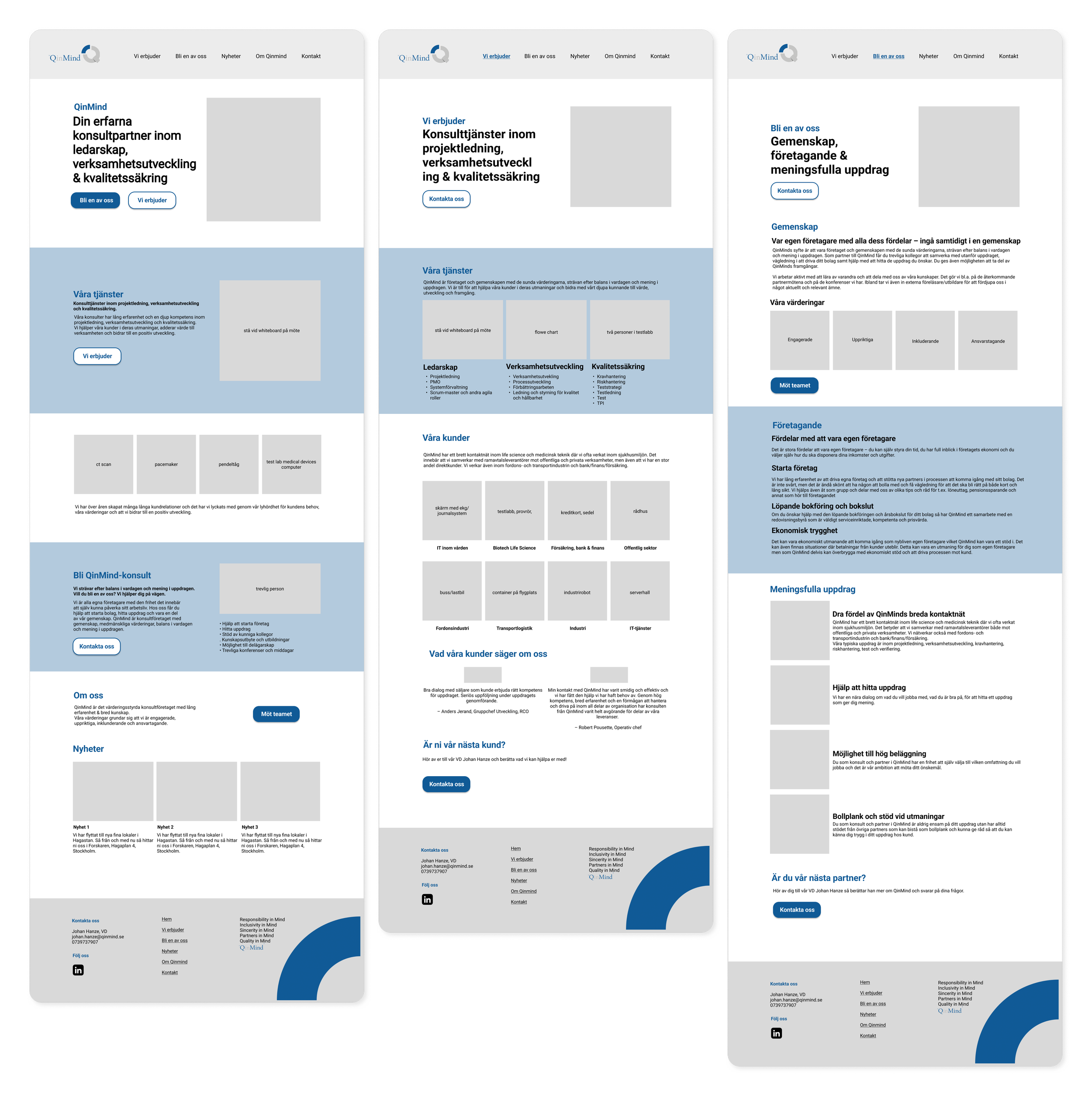
Wireframes
I mapped out the site architecture and created wireframes to define the information flow. The challenge was to balance the dual-pathway without cluttering the interface.
This was an iterative process, where I worked closely with the client. This ensured that every section served a clear purpose before any visual elements were added.
Visual Direction
To bridge the gap between technical and human, I introduced new elements and design components to the existing visual identity.
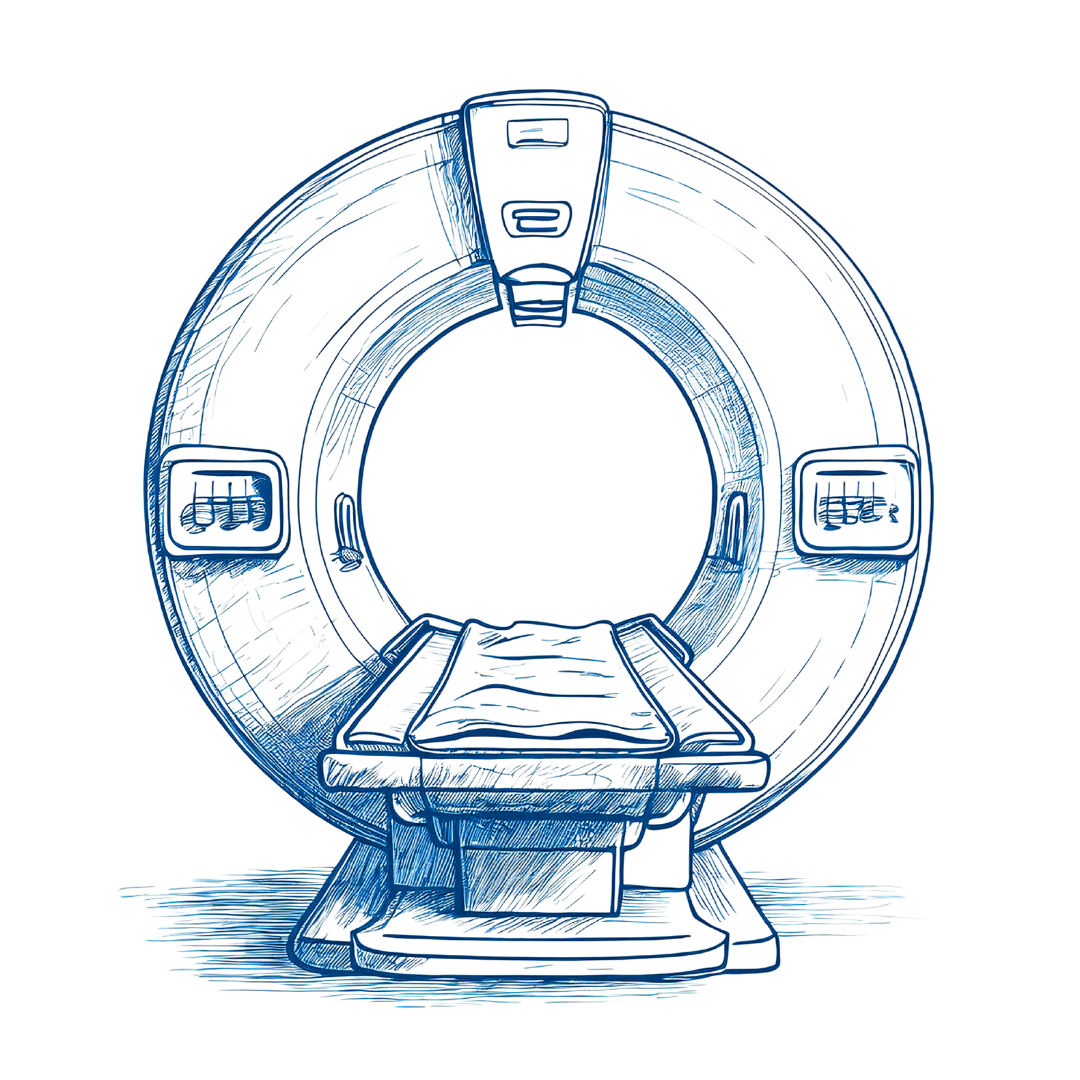
✦ The Blueprint Style
Utilizing AI-driven design, I developed a library of custom illustrations with a hand-sketched feel, to represent the human hand behind technical solutions.
✦ Modern Typography
I moved away from the traditional serif fonts used in the logo, introducing a sans-serif typeface for a cleaner, digital-first look.
✦ Adding a Sense of Warmth
I retained the original navy blue to maintain a feeling of trust and stability, while introducing vibrant orange as an accent to bring in energy and warmth.


04. The Outcome
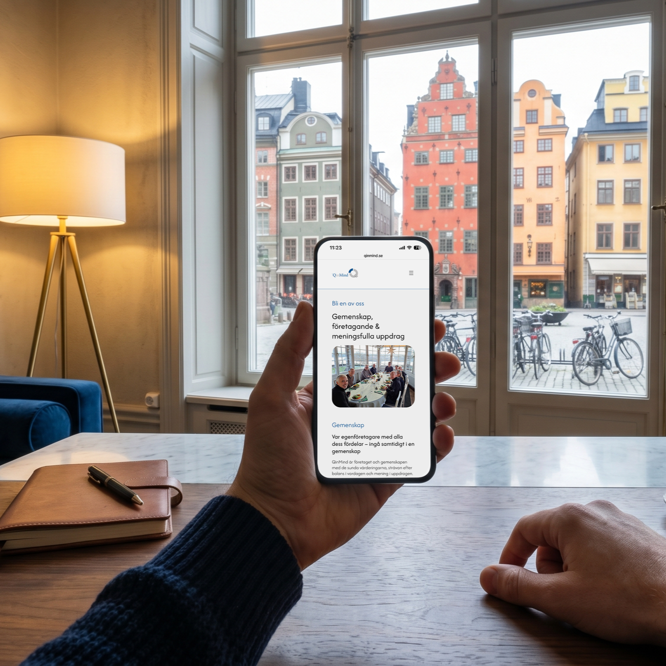
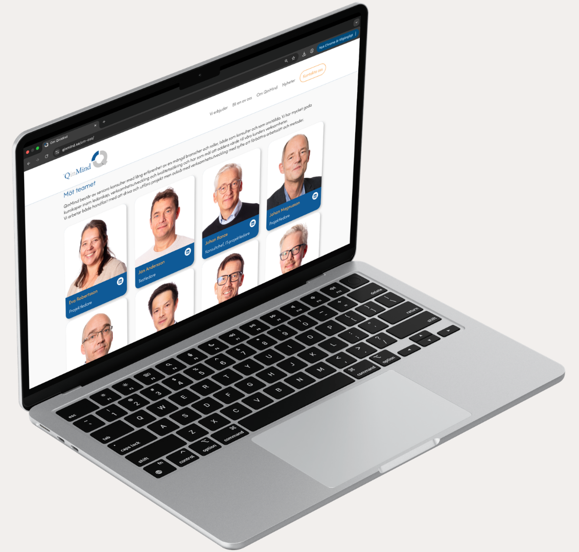
I built the entire website from scratch in WordPress, transforming it into a functional and responsive tool that the client can now easily manage on their own. The result is a digital suit that finally fits QinMind’s culture - professional, modern and warm.
✦ A Clear Path for Everyone
I solved the audience gap with a navigation that guides both clients and consultants. By creating distinct entry points, I ensured every visitor finds what they need, making both user journey seamless.
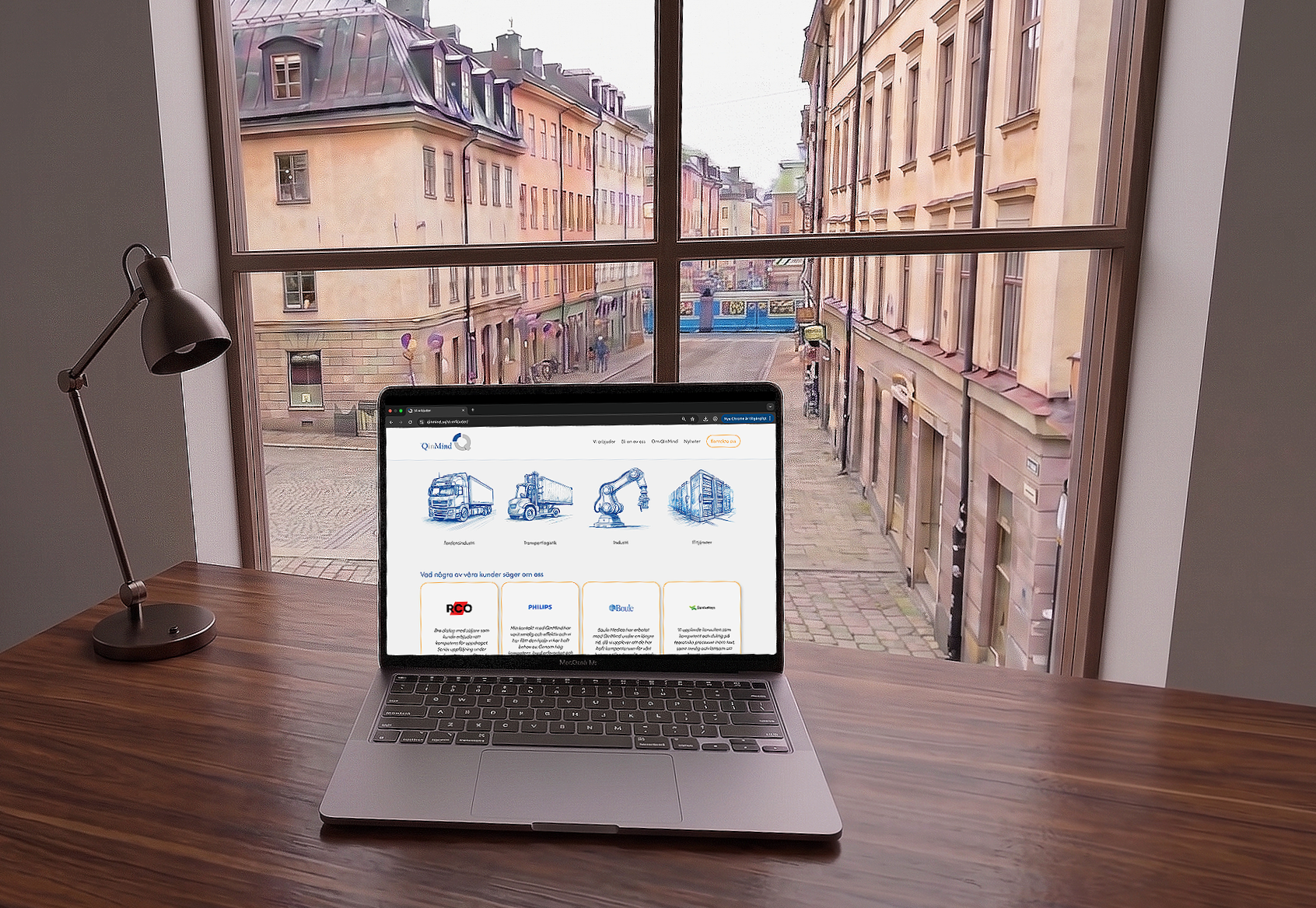
✦ Humanizing the Technical
Using hand-drawn illustrations and orange accents, I replaced the cold tech aesthetic with warmth. This highlights the people behind the expertise, making the brand feel approachable and inviting.
✦ A Catalyst for LinkedIn
The new content and structure provided a foundation for a new LinkedIn strategy. Having pages to link to that provides real value turned an untapped channel into a key tool for attracting both new talent and potential clients.
✦ A Positive Network
Feedback from the client’s network has been incredibly positive. The new site hasn't just improved their look - it has bridged the gap between who QinMind actually is and how they are perceived online.
Pssst! Did you know I also captured all the photography you see on this website!
05. The Retrospective
Key Learnings
✦ Solo Ownership
Managing this project entirely on my own, from the first strategy meeting to the final WordPress launch - gave me a bigger understanding of how design choices impact the development process.
✦ Strategic Branding
I learned how a single bold accent can modernize a brand and shift its energy without losing its core.
✦ Dual-Audience UX
Balancing the needs of both clients and partners taught me how to maintain a strict information hierarchy.
✦ The AI Workflow
I mastered a consistent prompt strategy to create a unique visual language, replacing generic stock photos with custom illustrations that fit the brand perfectly.
Reflection
If I were to revisit this project with more time, my first priority would be to move beyond internal feedback and conduct formal usability testing with the two different target groups.
I would also love to explore introducing subtle micro-interactions and scroll-triggered transitions to bring a greater sense of life to the site. Animating the sketches, implementing smooth UI feedback and motion patterns would make the tailored experience feel more intuitive.
Curious for more? See what else I’ve been up to!
MoMo
Designing for
women’s well-being.

Äldrekontakt