
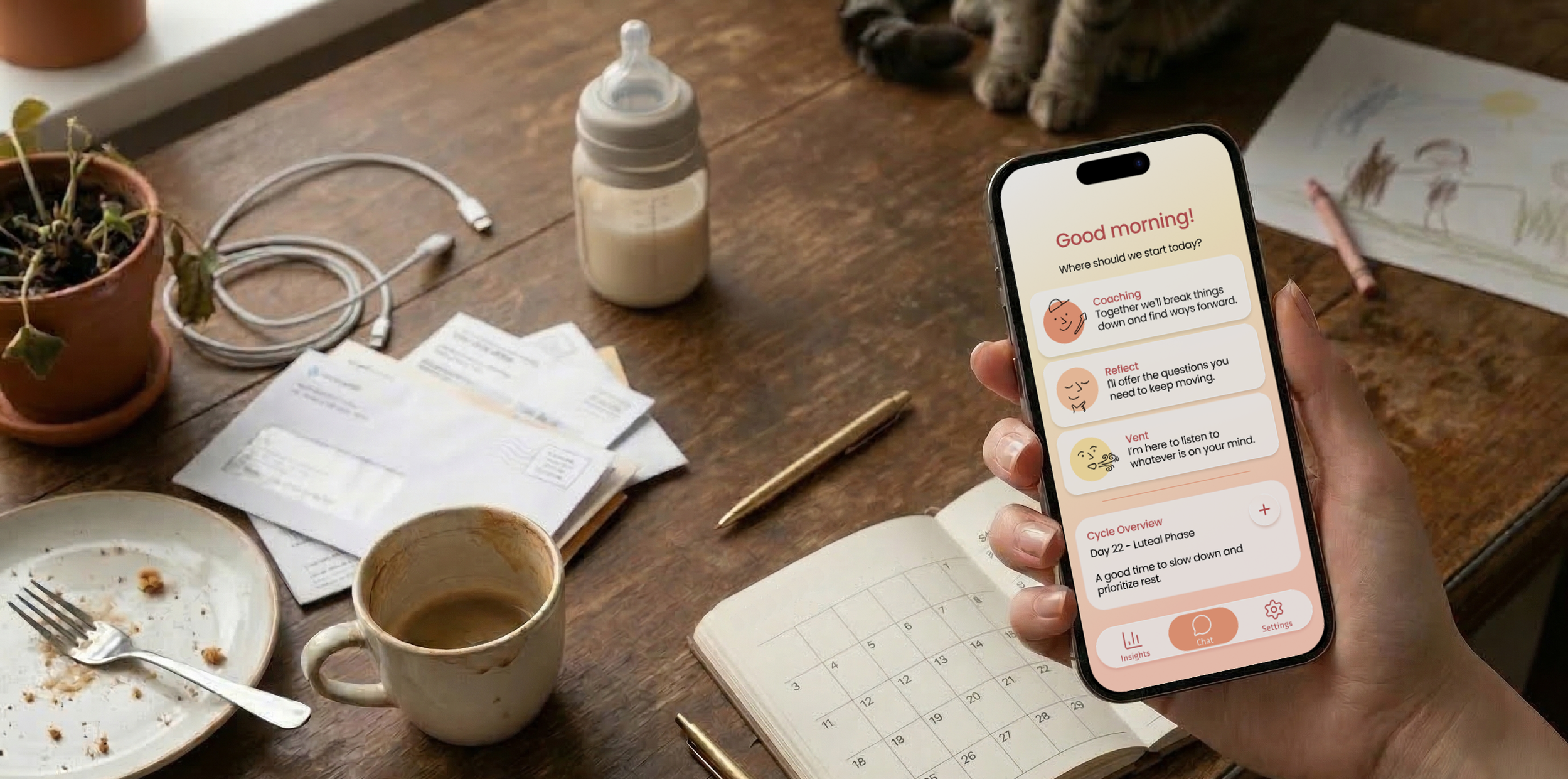
Designing for women’s well-being.
As part of the course "UX Research, Service Design and Usability Testing," I participated in a collaborative student project with the startup MoMo. Our team was tasked with refining the design of a mobile application serving as an AI-powered coaching companion.
We transformed an early-stage concept into an intuitive, safe, and enlightening experience, designed to make self-leadership and inner clarity accessible for every woman.
⚓︎ Context
Experience Architecture
User-centric Development
Research-based strategy
❖ Team
Project team of 5 students
⚙︎ Tools
Figma
01. The Why
The Challenge
The original version of MoMo had certain areas for improvement, as users struggled to understand the app's core purpose and felt overwhelmed by the interface.
✦ Difficult to Get Started
Users struggled to start using the app, because of the overwhelming design and unclear purpose.
✦ Privacy Hesitation
Users felt uneasy sharing personal thoughts with an AI without clear information on how their data was handled.
✦ The Friction Barrier
Interaction felt demanding. Every extra click was perceived as an administrative "must-do" rather than a support system.
The Strategic Pivot
During the project, the client chose to pivot the target group specifically to women. Empirical research indicated a higher demand for this service within this demographic, making it a vital direction for MoMo’s growth.
The Goal
To clarify MoMo’s user needs and map out a simple, intuitive interaction flow that supports consistent, meaningful growth - specifically for women.
02. The Discovery
We began by conducting 10 interviews and observations to identify expectations of an AI coach. This research led us to identify three core behavioral types:
✦ The Organizer - Seeks structure and order
✦ The Optimizer - Focuses on efficiency and growth
✦ The Coper - Prioritizes emotional stability
While all types were relevant, based on our client's strategic goals, we placed our primary focus on The Coper. This persona seeks a safe place where it is okay to have low energy and take small steps forward without pressure or guilt.

Key Insights
✦ Safety First, Vulnerability Second
Sharing deep thoughts is only possible if users feel their data is safe and strictly confidential.
✦ Growth is Not a Task
The core value is in a chat that listens, reflects, and asks the right questions, rather than providing a checklist.
✦ To Fully Support Her Well-being
Integrating menstrual cycle tracking is essential for a holistic view of a woman’s well-being.
03. The Process
Workshops & Prioritization
We ran a structured ideation workshop using a Crazy 8s "Bad Ideas" variation to spark creativity by flipping negative concepts into positive features. We then evaluated the ideas created through the Six Thinking Hats framework.
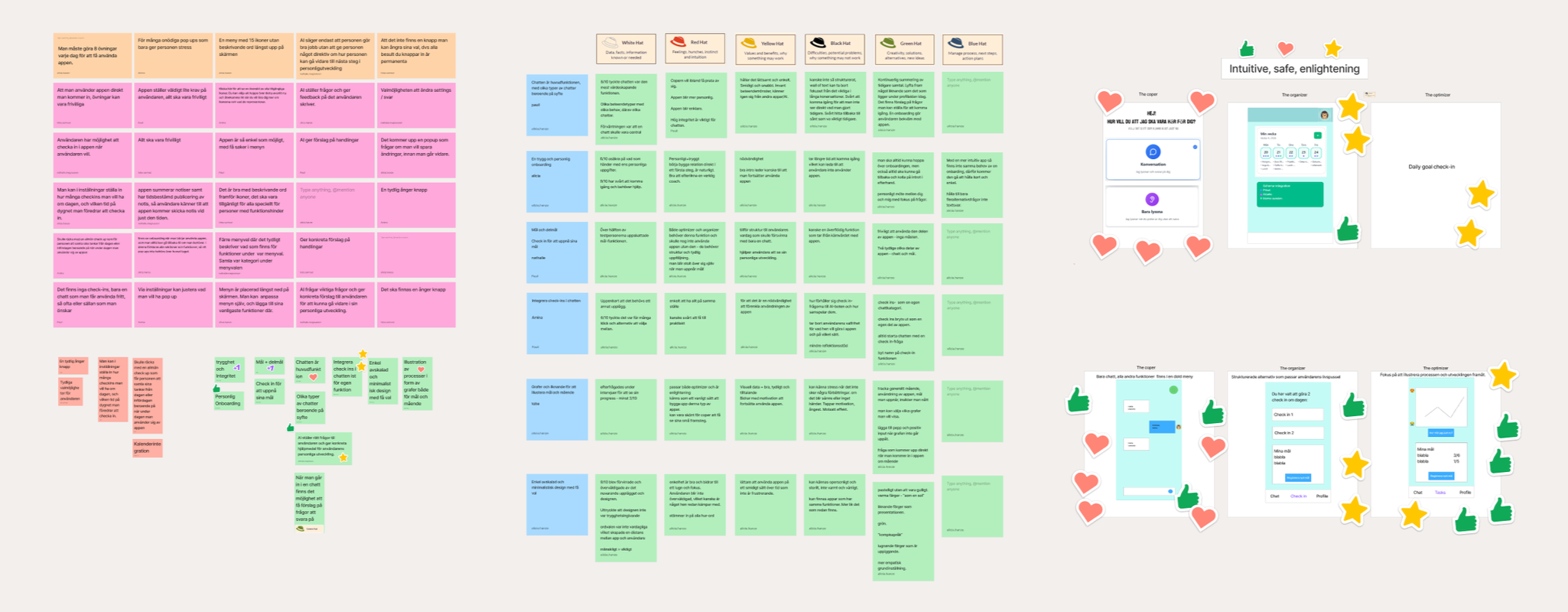
After presenting our ideas to the client, we together choose to prioritize a safe and personal onboarding, chat at the core with multiple modes, integrated check-ins in the chat and a simple design with few choices.
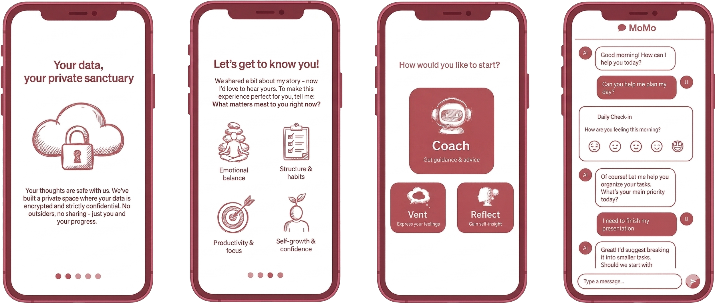
Designing With The Coper in Mind
We started with wireframes to find an intuitive and simple flow, and then moved on to high-fidelity designs prioritizing calm, predictability and safety.
✦ A Foundation of Trust
Designing a safe onboarding that builds immediate trust through early privacy assurances and a warm and clear introduction to the app’s purpose.
✦ Warmth & Human Touch
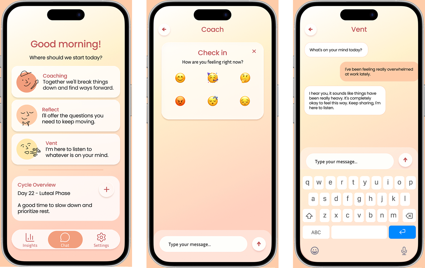
Utilizing soft shapes, warm tones, and my custom minimalist illustrations, to humanize the interface and reduce cognitive load.
✦ Minimalist Hierarchy
A stripped-down interface with a clear visual hierarchy and limited choices for a focused, intuitive journey.
✦ Core Chat Modes
Establishing three distinct modes - Coach, Reflect and Vent, providing immediate clarity on how the AI supports the user.
✦ Integrated Check-ins
Replacing demanding daily surveys with seamless, one-click mood logging directly within the chat conversation.
✦ Integrating Cycle Sync
Connecting menstrual phases to emotional patterns to provide a holistic and unique differentiator for the target group.











04. The Outcome
The final result is a cohesive platform bridging the gap between AI technology and emotional well-being. Our usability tests confirmed the impact of this refinement, with a clear majority preferring our version for its warmth, safe and intuitive feel compared to the original.
✦ Trust Through Onboarding
The new onboarding built immediate trust through early privacy assurances and a clear introduction, ensuring users felt safe and guided from the start.
The Original Design
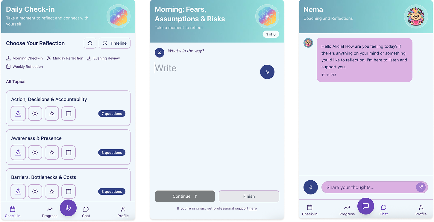
The New Design
✦ Intuitive Chat Architecture
Users immediately understood the app’s purpose through the three distinct chat modes - making every interaction's intent clear.
✦ Holistic Health Integration
The Menstrual Cycle Syncing stood out as the app’s clearest differentiator, with users highlighting the enlightening value of connecting their cycle phase to their emotional patterns.
✦ Seamless Mood Tracking
The transition to chat-based check-ins was a success. Users moved through the flow without friction, valuing the ability to register feelings with a single click.
✦ A "Less is More" Experience
By stripping the interface to a clean hierarchy, we transformed a clinical tool into a "calming sanctuary".
05. The retrospective
Key Learnings
✦ Agility in a Startup Environment
Working with an early-stage startup like MoMo emphasized the importance of flexibility. Strategic pivots - such as the shift to a female-focused demographic, require a strategy that can quickly adapt to new data and user needs.
✦ The Power of a Defined Target Group
Narrowing our focus from a broad audience to specifically supporting women was a turning point for the project. This clarity allowed us to move beyond generic features and develop high-value differentiators like Cycle Syncing, which created a much deeper emotional resonance with our primary users.
✦ Trust as a Design Requirement
Privacy is not just a technical feature but a psychological one. Establishing a Foundation of Trust early is what ultimately enables the user's vulnerability and long-term engagement. Beyond data security, I realized that trust is also visual - utilizing a warm color palette and soft shapes was crucial in transforming a clinical interface into a space where users felt safe to share their deepest thoughts.
Reflection
While the project prioritized the chat as the core value, our research and testing indicated that users also crave clear, visual overviews of their progress. While the chat is excellent for reflection, presenting complex data visually can significantly reduce the cognitive load for users. Therefore, the Insights view requires further iteration.
In an individual deep dive, I chose to further explore this by challenging the "chat-first" approach to reduce friction and unnecessary clicks. My goal was to develop a Insights-view that feels enlightening and intuitive without becoming overwhelming. I also wanted to test the hypothesis that correlating mood and the menstrual cycle with external factors creates a more holistic and enlightening path to self-understanding for women.
Curious for more? See what else I’ve been up to!

Äldrekontakt
New look, same
heartwarming mission.

QinMind